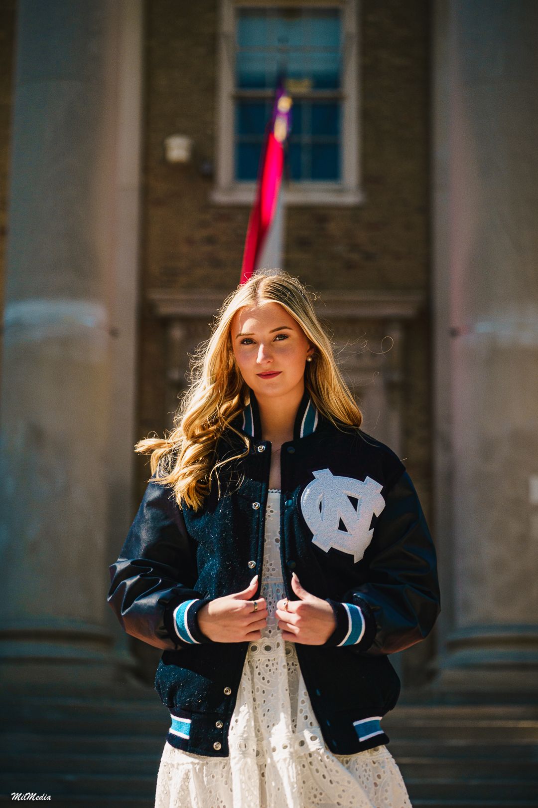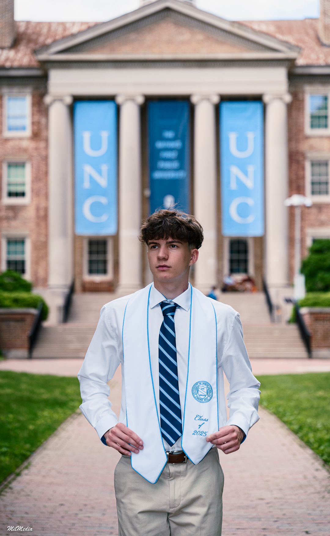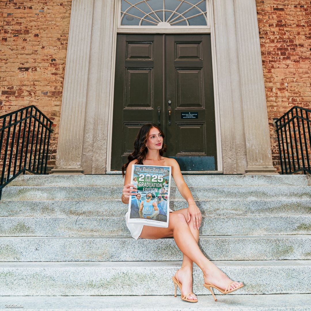
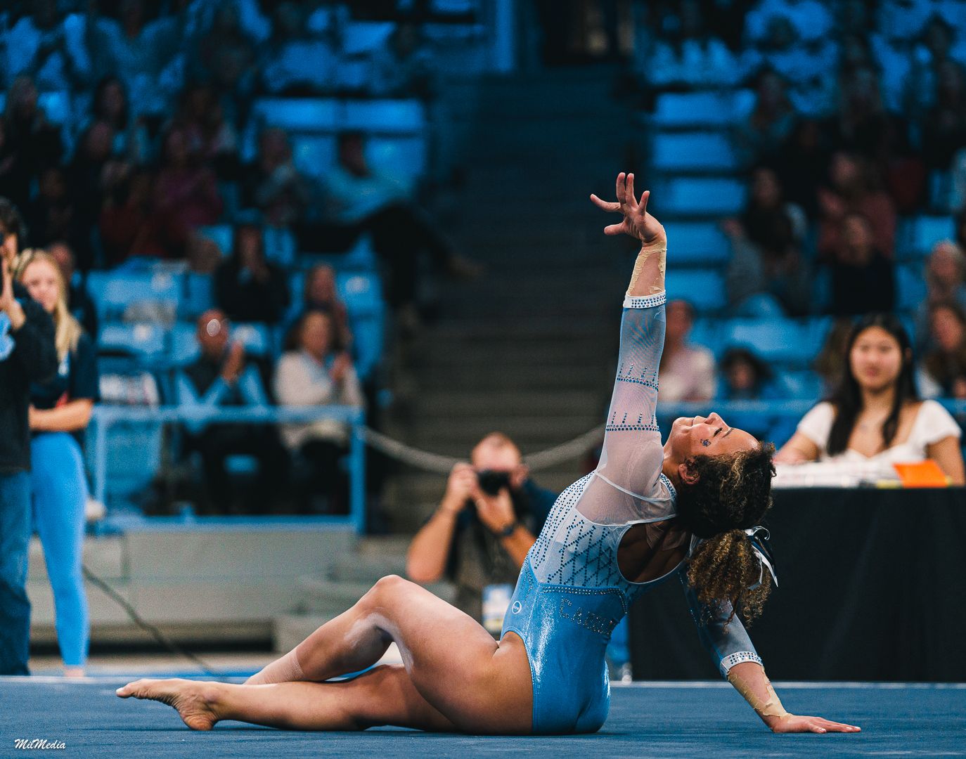
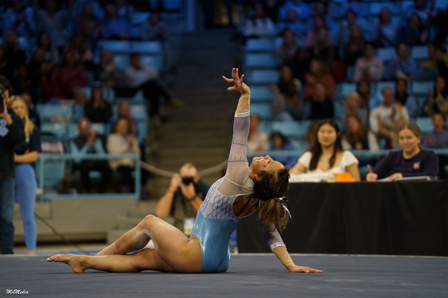
Two photos can be taken in the same place, at the same time, with the same pose — and still feel completely different.
Why?
Editing and color style.
Most people searching for senior portraits, graduation photos, or professional photography near me focus on the moment of capture. But what happens after the shutter clicks is just as important as what happens before it.
Editing is not about “fixing” a photo.
It’s about finishing the story.
If you’re the hero of the image, editing is the soundtrack. It tells your brain how to feel when you look at the photo years later.
Let’s break down how editing and color style shape mood — and how to recognize what style fits your story.
The Photo Isn’t Finished in Camera
A camera records information.
Editing creates interpretation.
Think of a raw image like a rough draft. The light, color, and contrast are there — but they haven’t yet been shaped into a voice.
Through editing, a photographer adjusts:
Color tone
Contrast
Brightness
Skin tones
Background balance
Overall atmosphere
This is why two photographers can photograph the same senior portrait session and deliver galleries that feel completely different.
Not better or worse — but different in mood.
Warm Color Styles Feel Emotional and Nostalgic
Warm editing styles lean toward:
Golden tones
Rich highlights
Softer contrast
Natural warmth in skin tones
This style is common in:
Outdoor senior portraits
Graduation photography
Family photos
Golden hour sessions
Warm color grading creates a feeling of:
Memory
Reflection
Sentiment
Story
When people search timeless senior photos or cinematic graduation portraits, they’re often drawn to warm edits without realizing why.
Warmth feels human. It feels lived-in.
Cool Color Styles Feel Modern and Clean
Cool color styles shift tones toward:
Blues
Neutral grays
Crisp whites
Reduced warmth
This look is often used in:
Urban senior portraits
Branding sessions
Studio photography
Editorial-style shoots
Cool editing creates a mood of:
Precision
Modernity
Focus
Professionalism
If your personality or brand leans bold, structured, or minimal, cooler color grading often matches that energy.
It feels forward-looking instead of reflective.
High Contrast Feels Bold and Dramatic
Contrast is the difference between light and dark areas in a photo.
Higher contrast editing produces:
Deeper shadows
Brighter highlights
Stronger edges
More visual punch
This is common in:
Athletic senior portraits
Dramatic graduation photos
Fitness and sports photography
Bold portrait photography
High contrast feels:
Confident
Intense
Powerful
Attention-grabbing
When someone says they want bold senior photos that stand out, contrast is usually part of what they’re responding to.
Low Contrast Feels Soft and Calm
Lower contrast editing softens transitions between light and dark.
It creates:
Gentle tones
Muted shadows
Even transitions
Airy mood
Often seen in:
Light and airy photography
Lifestyle portraits
Soft outdoor sessions
Low contrast feels:
Peaceful
Open
Gentle
Dreamlike
This style is less about impact and more about ease.
Color Saturation Changes Energy
Saturation controls how intense colors appear.
Higher saturation:
Feels energetic
Feels vibrant
Feels youthful
Feels expressive
Lower saturation:
Feels cinematic
Feels mature
Feels serious
Feels artistic
For college senior portraits, saturation choices often depend on personality. Creative, high-energy seniors often prefer richer color. Cinematic or dramatic styles often pull color back slightly for mood.
Skin Tone Handling Is the Trust Factor
No matter the style — warm, cool, bold, or soft — good editing protects skin tones.
Professional photo editing ensures:
Natural skin color
Consistent tone across images
No strange color casts
Balanced highlights and shadows
When browsing how to choose a senior photographer, this is something to watch closely in portfolios. Bad skin tone editing breaks trust instantly.
Good editing makes style visible — not mistakes.
Consistency Creates Identity
The strongest photography portfolios are consistent in editing style.
Consistency tells you:
The photographer understands their visual voice
Your gallery will feel cohesive
The mood is intentional
Random editing styles across one gallery create emotional confusion. Cohesive color grading creates narrative clarity.
This matters for:
Senior portrait galleries
Graduation announcements
Personal branding photos
Portfolio use
Consistency turns photos into a visual story instead of a mixed collection.
How to Choose the Right Editing Style for Your Senior Photos
Ask yourself:
How do I want these photos to feel in 10 years?
Reflective → Warm, cinematic tones
Bold → High contrast, strong color
Modern → Cool, clean tones
Artistic → Muted, stylized color
You’re not choosing a filter.
You’re choosing a mood.
And mood is memory.
The Takeaway
Editing and color style don’t change what you looked like.
They change how the moment feels when you remember it.
The best senior portraits and graduation photos aren’t just captured — they’re crafted.
Because long after details fade, feeling remains.
Frequently Asked Questions
What is photo color grading?
Color grading is the process of adjusting tones and colors to create a specific mood or style.
Is editing the same as retouching?
No. Editing shapes overall color and mood. Retouching fixes small details like blemishes or distractions.
Do all photographers edit the same way?
No. Editing style is part of a photographer’s signature look.
Can editing make a basic photo look dramatic?
It can enhance mood, but it can’t replace good lighting and composition.
Are warm edits more timeless?
Often yes, but timelessness comes more from consistency than temperature.
Do bold edits go out of style?
Trends change, but strong, intentional color grading holds up when applied thoughtfully.
Should I request a specific editing style?
You can — but it’s usually best to choose a photographer whose natural style you already like.
How long does professional editing take?
For senior portrait galleries, often 1–2 weeks depending on workflow and volume.
Why do my phone photos look different from professional edits?
Phones auto-process images differently and with less precision than professional editing workflows.
Can editing change my skin tone?
It should refine and balance — not distort. Natural skin tone is always the priority in good editing.